WAKABETA
SectorFintech
Year2025 – 2026

Redesigning everyday services for a seamless experience.

Movement Is In The Name
Brand Story
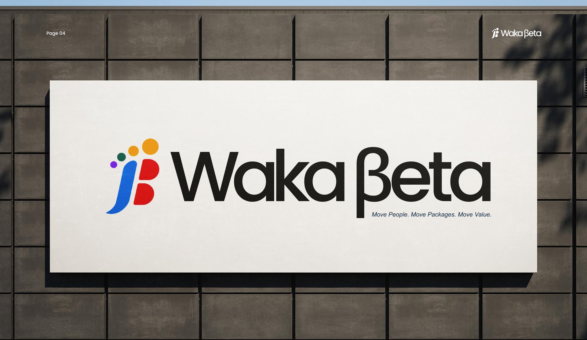
WAKABETA brand application

The name Wakaβeta brings together two powerful ideas. "Waka" is a widely recognised West African expression for movement, travel, and journey. "βeta" represents progress, innovation, and continuous improvement. Together, they embody a simple belief: every journey should create new opportunities.

Wakaβeta connects transportation, delivery, payments, and essential digital services within one seamless ecosystem — making it easier for people and businesses to move, send, pay, and grow.
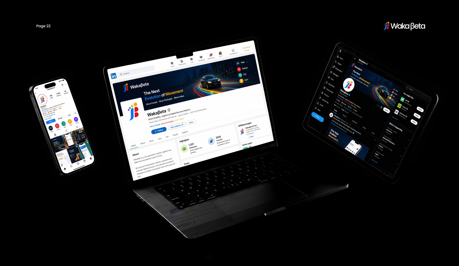
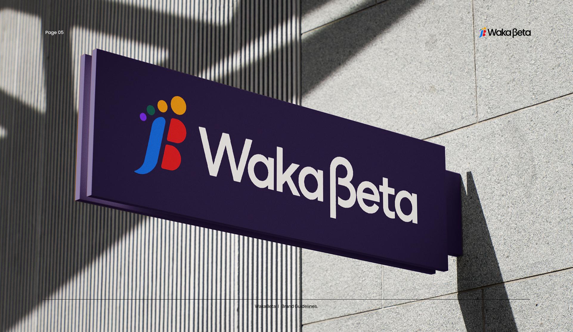
WAKABETA brand application

Waka and βeta were never separate ideas — movement only means something when it keeps improving, and improvement only matters when it actually gets people somewhere.

That's the belief the whole brand is built on: every ride, delivery, payment, and login is one more small journey Wakaβeta is trying to make a little easier than the last.

Wakaβeta exists to empower movement, unlock opportunity, and help communities thrive through technology.

Move

Get people where they need to go, safely and on time.

Send

Deliver packages and goods across the city and beyond.

Pay

Send, receive, and manage money within one trusted platform.

Earn

Unlock income opportunities for drivers, riders, and partners.

A Step Forward, Made Visible

Identity
WAKABETA logo

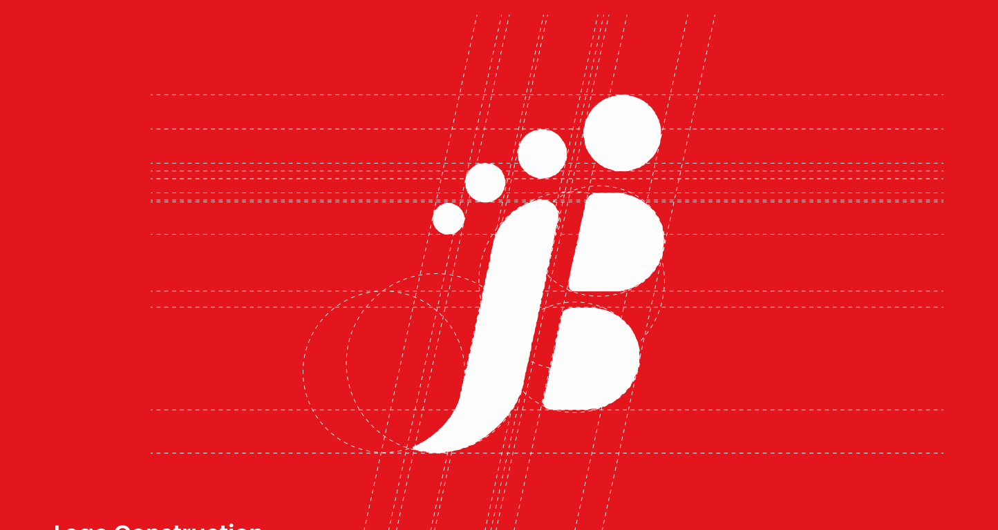
The Wakaβeta brandmark is inspired by the idea of forward motion. Its form combines the visual language of a footprint, movement, and the letter "B", creating a symbol that represents progress, journey, and continuous growth.

The footprint-inspired shape reflects the meaning of "Waka" — a widely recognised expression for movement and travel. The ascending elements within the mark represent milestones, opportunities, and the positive impact created through every journey.

WAKABETA logo construction
Logo Construction
MovementFootprint + forward lean shows motion and action.
JourneyEvery step represents progress and the journey forward.
GrowthAscending dots (toes) symbolise growth and improvement.
OpportunityThe open shape creates space for new possibilities.
InnovationModern shapes and bold colours reflect tech and forward thinking.
WAKABETA brand application
Simplicity

Effortless experiences that remove friction from everyday movement.

Reliability

Consistent, dependable service people can build their day around.

Value

Fair pricing and real opportunity for everyone who moves with us.

WAKABETA brand application
Blue#155EEF
Red#FF3B30
Yellow#FFC300
Teal#14B8A6
Purple#7C3AED
Black#0A0A0A
White#FFFFFF
AaPoppins

Wakaβeta uses Poppins as its primary typeface. Clean, geometric, and highly legible, Poppins reflects the brand's values of simplicity, innovation, and accessibility — delivering a visual voice that is modern, reliable, and designed for a digital-first world.

Modern · Clean · Geometric · Accessible · Friendly · Professional · Digital-First

Confident

We speak with clarity and certainty — never hesitant, never overpromising.

Clear

Plain language over jargon. Every message should be instantly understood.

Encouraging

We champion progress, celebrating every step forward, however small.

Grounded

Practical and honest, built for the realities of African markets.

The Impact

A single identity now carries every service

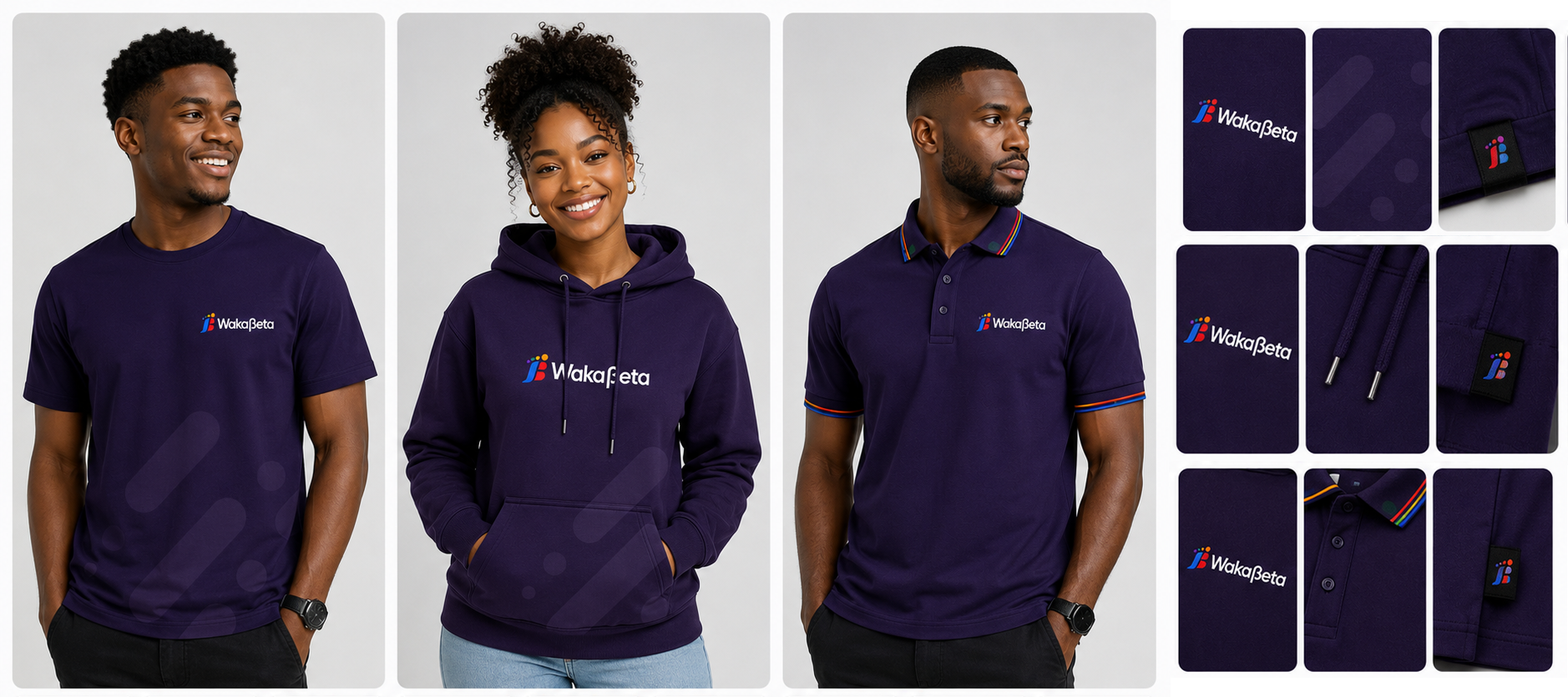
Since the rebrand, Wakaβeta has rolled the same identity system out across its mobile apps, vehicle branding, uniforms, and marketing — turning four separate services into one recognisable, trusted brand across its cities.

1.2M+Active Users
98.4%Completion Rate
4.9 ★App Rating
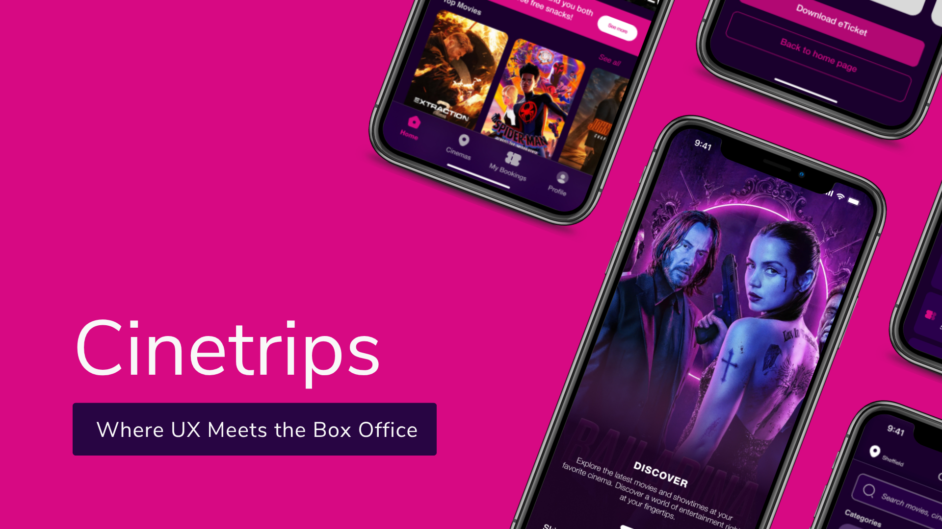
CINETRIPS preview
Next Up

CINETRIPS

View Case Study

Have an idea worth shaping?

LET'S BUILD SOMETHINGMEANINGFUL.

I design digital products that solve real problems and create real impact.